The Science Behind Game Color Palettes
6 January 2026
When you think about what makes your favorite video games so memorable, you probably picture the characters, the stories, or epic boss battles. But have you ever paused to think about the color palette? Yep, those vibrant (or sometimes moody and dark) colors aren't just there for aesthetic vibes—they’re rooted in science, psychology, and a massive amount of design thought.
Color palettes in games are much more than eye candy. They're a powerful storytelling tool, a gameplay mechanic, and even a psychological trigger that influences how we feel as we play. Let’s dig deep into the science behind game color palettes and how they impact your gaming experience in ways you probably never noticed.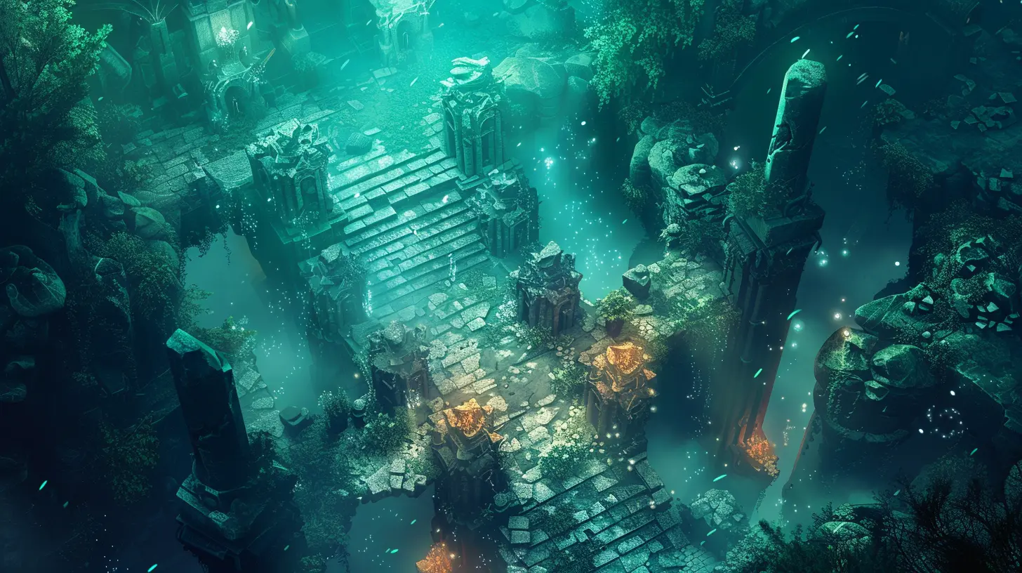
Why Color Palettes Matter in Games
Color isn't just about looking good. In video games, a color palette plays multiple roles:- It sets the tone and atmosphere.
- Guides the player through the level design.
- Communicates game mechanics and emotional states.
- Helps with brand identity (think of Mario's red and blue combo).
Imagine playing a horror game with bright, sunny pastels. Doesn’t exactly scream terrifying, right? That’s because our brains associate certain colors with certain emotions.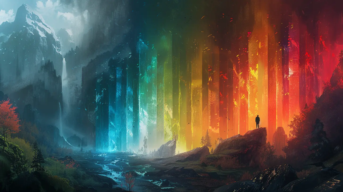
Color Theory: The Foundation of Game Color Palettes
Let’s break it down—color theory is the backbone of any visual art, including game design. It’s basically the science of how colors mix, how they complement each other, and how they affect human perception.The Color Wheel
Remember that good ol’ color wheel from art class? It's still relevant. Designers use it to choose complementary or contrasting color schemes. There are a few key combinations:- Complementary Colors: Opposites on the wheel (like blue and orange) that pop when used together.
- Analogous Colors: Neighbors on the wheel (like green, blue, and teal), which feel harmonious.
- Triadic Colors: Evenly spaced (like red, yellow, blue), giving a balanced, vibrant look.
These combinations matter because they help designers create visually interesting environments that don’t overload your senses.
Warm vs. Cool Tones
Warm colors (red, orange, yellow) tend to evoke excitement, urgency, or aggression. Cool colors (blue, green, purple) are calming, mysterious, or melancholic. Game designers use this to their advantage. Ever noticed boss fights are often drenched in red hues? That’s no accident.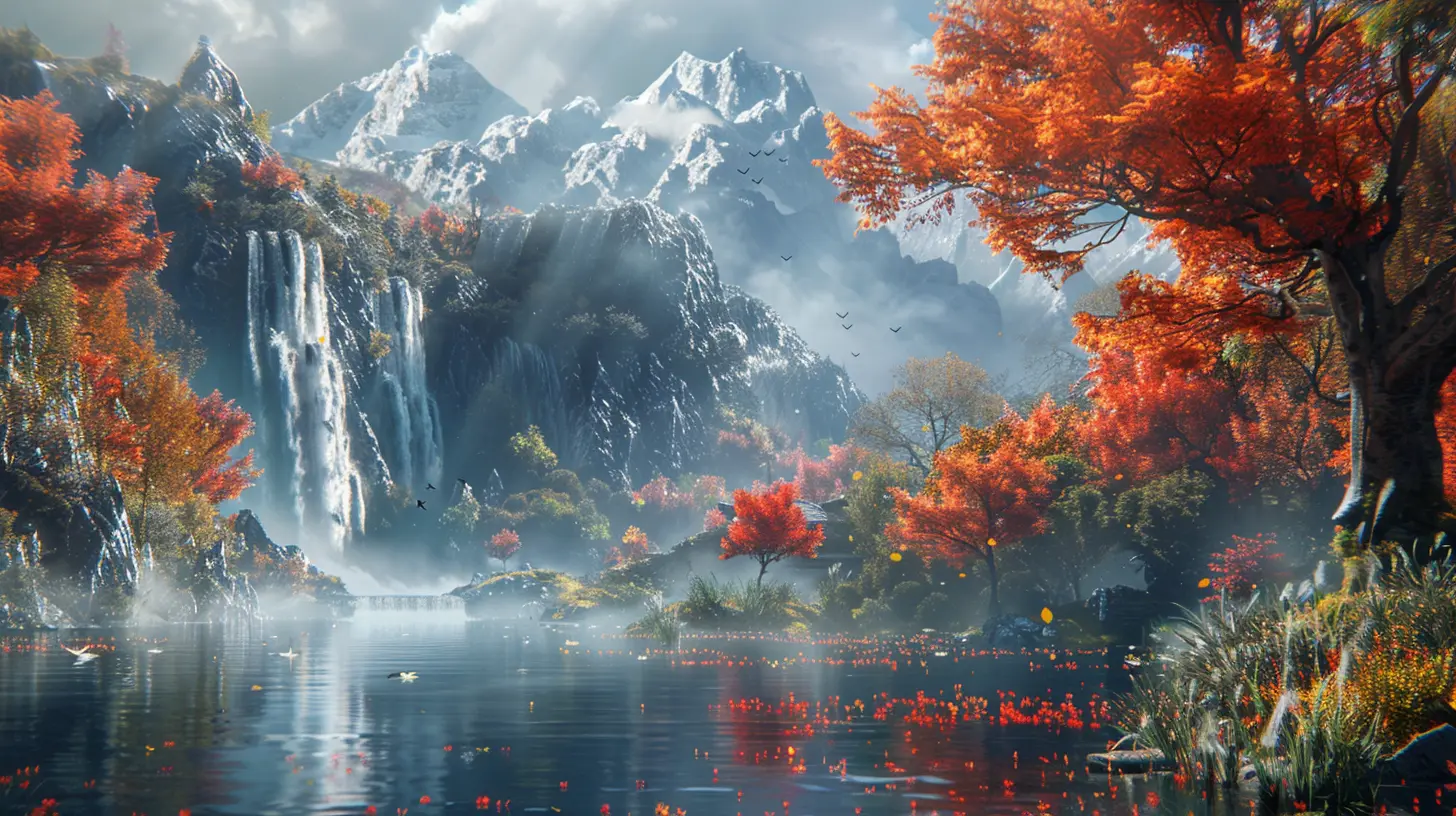
Psychology of Color in Gaming
Colors affect our emotions. It’s a bit like a cheat code for our brains. Marketers have been using this for years, and game developers are no different.- Red: Danger, urgency, power. Often used in health bars, warnings, or intense scenes.
- Blue: Calm, trust, intelligence. Common in puzzle games or peaceful levels.
- Green: Health, nature, or safety. That classic health regen color.
- Yellow: Energy, caution, happiness. Often used to highlight interactable items.
- Purple: Mystery, magic, luxury. Great for fantasy elements or unknown objects.
This emotional association helps players react without thinking. See red? Dodge! See green? Safe zone.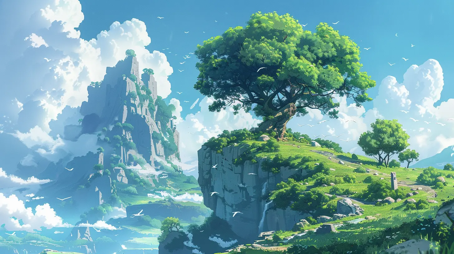
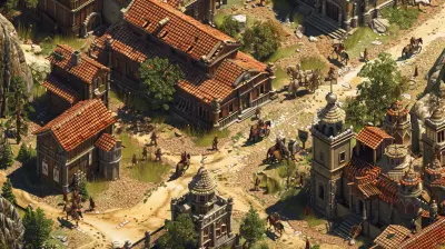
Iconic Games and Their Color Palettes
Want proof that color palettes make or break a game? Let’s look at some iconic examples.1. Limbo (2010) – Monochrome Masterpiece
Limbo is a hauntingly beautiful example of minimalism. It uses only black, white, and shades of gray. The lack of color heightens the eerie atmosphere and leaves you feeling unsettled—perfect for its dark subject matter.2. The Legend of Zelda: Breath of the Wild – Natural Harmony
This game uses a soft, earthy palette with vibrant splashes of color. It makes exploration feel magical and peaceful, matching the open-world vibe full of discovery.3. DOOM (2016) – Red Hot Intensity
DOOM doesn’t hold back. Saturated reds, deep blacks, and glowing orange hues reflect its fast-paced, explosive gameplay. You can feel the chaos.4. Journey – Emotional Evolution
Journey subtly changes its color palette as the game progresses. It starts warm and bright, gets colder and darker, then glows with ethereal light near the end. It mirrors the emotional arc of the player’s journey without a single word of dialogue.Color as a Gameplay Mechanic
Colors aren’t just pretty—they're part of the game’s language. Designers use them to:- Direct attention: Bright colors draw the eye. Think glowing platforms or shiny coins.
- Indicate danger or safety: Red for traps, green for healing zones.
- Differentiate teams or classes: Think MOBAs or battle royales.
- Convey power-ups or status effects: A character glowing blue? Probably invincible or powered up.
One cool example is in Portal. The two portals—orange and blue—are easy to tell apart and guide the player's navigation without needing extra UI clutter.
Accessibility and Inclusivity in Game Color Palettes
Not everyone sees color the same way. Colorblindness affects approximately 1 in 12 men and 1 in 200 women. That’s a big chunk of gamers!Game devs are increasingly mindful of this by:
- Using texture differences alongside color.
- Implementing colorblind modes (like in Overwatch, Fortnite, and League of Legends).
- Avoiding color-only cues for crucial info.
Games that consider accessibility not only reach more players, but also create a more inclusive and thoughtful experience.
Tools and Techniques Game Designers Use
Designing a color palette isn’t just trial and error. There's science and tech behind the scenes.Color Grading
After the visuals are built, designers tweak hues and tones to match the mood. Think of it like applying a filter on a photo—it changes the entire emotional vibe.LUTs (Look-Up Tables)
These are preset color adjustments that help developers maintain consistency. It's like choosing a filter in Instagram but for every frame of a game.Iteration and Feedback
Most color palettes evolve over time, based on:- Playtester feedback.
- Emotional response testing.
- Gameplay clarity assessments.
It’s not just about what looks good—it’s about what feels right and communicates effectively.
Cultural Context and Color Interpretation
Here’s where it gets even more interesting: color meanings can change across different cultures. In Western cultures, white often represents purity. But in some Eastern cultures, it’s associated with mourning.Game developers have to think globally, especially for games with an international audience. This affects choices in:
- UI design
- Character outfits
- Color-coded systems
Ignoring cultural context can alienate players or send the wrong message.
The Future of Color in Gaming
As graphics tech evolves—think ray tracing, HDR displays, and OLED screens—so does the potential for jaw-dropping color palettes. We're entering a world where:- Colors feel more lifelike and immersive.
- Games adapt palettes dynamically based on player emotion (yes, that tech exists).
- AI assists in color grading and palette creation.
Imagine a horror game that makes the environment subtly redder as your heartbeat increases. Creepy, but brilliant.
Final Thoughts
Color is everywhere in games—but it’s not random. Behind every hue, shade, and contrast is a carefully crafted choice grounded in psychology, science, and a deep understanding of player behavior. Whether it’s guiding your eye, setting a mood, or sparking an emotion, color palettes are a silent but powerful character in every game you’ve ever loved.So, next time you’re slicing through neon-lit cityscapes or wandering misty forests, take a moment to appreciate the science behind those colors. It’s not just art—it’s brain science with a splash of magic.
all images in this post were generated using AI tools
Category:
Game GraphicsAuthor:

Pascal Jennings
Discussion
rate this article
2 comments
Primrose Richardson
Great insights on how color palettes influence player emotions and immersion in gaming!
January 18, 2026 at 3:59 AM
Pascal Jennings
Thanks for your feedback! I'm glad you found the insights valuable. Color really does play a crucial role in shaping the gaming experience.
Vito McFarlane
This article brilliantly explores how color palettes influence player emotions and gameplay. Understanding the psychological impact of colors can enhance game design, creating more immersive and engaging experiences for players.
January 10, 2026 at 4:20 AM
Pascal Jennings
Thank you for your insightful comment! I'm glad you found the exploration of color palettes and their psychological impact on gameplay engaging. It’s fascinating how color can truly enhance the player experience!