The Psychology of Color in Game Design
27 May 2026
Ever wondered why some games make you feel calm, while others keep your heartbeat racing? Or why a red "Game Over" screen feels so intense, almost like it’s yelling at you? That’s no accident. Welcome to the captivating world of game design, where color isn’t just decoration—it’s communication.
Today, we're diving deep (and we mean deep) into the psychological impact of color in game design. This is not just about aesthetics. It’s about mood, behavior, attention, and even storytelling. From indie pixel-art masterpieces to big-budget AAA blockbusters, color plays a central role in every player’s journey.
Let’s break down how game developers wield colors like digital paintbrushes to take us on unforgettable adventures.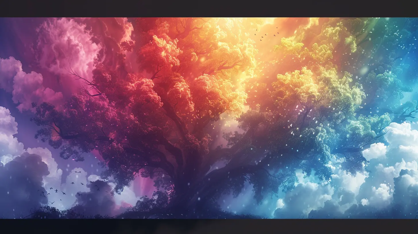
Why Color Psychology Matters in Games
Color is like a cheat code for emotions. It affects how we feel, think, and even how we behave—almost automatically. Game developers use this to their advantage to:- Set the mood of a level or scene
- Subtly guide player choices
- Highlight danger or safety
- Reinforce narrative arcs
- Create brand identity
Think about it. Would you feel the same way playing Dark Souls if everything were pastel pink? Probably not. Colors are emotional cues, and our brains are wired to respond to them—often without us even realizing it.
Red: The Color of Urgency and Danger
Let’s start with red—because red always gets your attention, doesn’t it?How Red Affects Gameplay
Red is intense. It's the color of danger zones, low-health warnings, and boss battles. And it’s not random. Psychologically, red increases heart rate and creates a sense of alertness. It’s primal, like the color of blood or fire, triggering a natural fight-or-flight response.Where You’ll See It in Games
- Health meters depleting into red- Alarms or urgent events (think: countdowns)
- Aggressive enemies or high-stakes challenges
In fast-paced shooters and horror games, red is often a visual scream—loud, unavoidable, and emotionally charged.
Blue: Calm, Clarity, and Control
On the flip side of red, we have blue. It’s soothing. It gives you space to breathe.Why Blue Feels Safe
Blue is often associated with trust, stability, and peace. That’s why many menus, UI elements, or pause screens use blue—it helps you relax and refocus. And in strategy games or simulators, blue environments suggest control, logic, and order.Blue in Action
- Menu backgrounds and option screens- Peaceful exploration zones or water levels
- Save points or respawn areas
It’s no coincidence that The Legend of Zelda: Breath of the Wild uses soft blue glows for spiritual places. Blue tells your brain: “Hey, everything’s okay here.”
Green: Growth, Balance, and Nature
Green's your go-to for anything natural or healing. It’s the color of life, and it often represents regeneration, safety, and environmental harmony.How Green Engages Players
In most games, green is code for health or resource renewal. But it also represents exploration and neutrality. It encourages players to venture further without fear.You’ll see green in:
- Healing items or potions
- Safe zones or checkpoints
- Forests, jungles, and natural landscapes
In survival games, green often becomes your lifeline. It gives you hope when everything else feels hostile.
Yellow: Alert Yet Optimistic
Yellow is a bit of a wild card. It’s bright, energetic, and impossible to ignore—but it can also spark caution.What’s So Special About Yellow?
Yellow activates attention. It’s often used for interactive objects, quests, or loot—basically anything you’re supposed to notice. But shade matters. A dull mustard yellow can feel sickly. A bright sunflower yellow? That’s energetic and exciting!Yellow's Game Roles
- Highlighting puzzles or secrets- Quest markers or icons
- Loot chests or pickup prompts
In puzzle games, yellow offers that “Aha!” moment. It helps guide player behavior in an encouraging (but firm) way.
Purple: Mystery, Magic, and the Unknown
Ah, purple. The color of wizards, bosses, and all things mysterious.Purple’s Psychological Edge
Purple embodies creativity, mysticism, and power. It often shows up in magical or otherworldly contexts. It’s both charming and intimidating—especially if paired with deep shadows or glowing effects.Purple's Role in Immersion
- Magic spells or arcane terrain- Final bosses or elite enemies
- Portals and dimensional rifts
Purple says, “You're not in Kansas anymore.” It’s often used to mark supernatural or high-level content.
Black and White: The Extremes of Design
Now let’s talk contrast. Black and white are design tools with serious attitude. They’re not just colors—they're the absence and sum of all colors respectively, and they carry strong emotional weight.Black: Elegance or Fear?
Black is often used to show death, danger, or the unknown. But in clean UI design, it can suggest elegance and focus.White: Clarity or Emptiness?
White can signify purity or divine presence. But too much white? It becomes sterile, even unsettling. Think of icy tundras or forgotten temples.When They Work Together
Games like Limbo and Inside use black and white palettes to enhance mystery, tension, and emotional storytelling. The absence of vibrant color sharpens every movement and sound, making the atmosphere haunting.Color Theory in Level Design
Color isn’t just about aesthetics—it can guide players through levels without arrows or signs.Visual Hierarchy Through Color
Smart color placement can:- Lead players through open-world environments
- Highlight interactive elements (doors, ladders, levers)
- Indicate progress (warm tones for forward, cool for backtracking)
Ever noticed how a door in a contrasting color always catches your eye? That’s intentional. Developers use color contrast to create a visual hierarchy—subconsciously telling you where to look and what to do.
Color and Memory: Why You Remember Certain Games
You ever wonder why you instantly recognize Journey or Cuphead from a screenshot? That’s the power of a well-chosen color palette.The Role of Palette Identity
Games that choose a distinct palette tend to stand out. Whether it’s Hollow Knight’s moody blues and grays or Splatoon’s neon chaos, strong color identity helps with brand memory.Iconic Examples
- Minecraft: Earthy tones with pops of vibrant green- Overwatch: Bright, saturated colors that reflect character personality
- Firewatch: Stunning twilight oranges and reds that evoke a specific mood
According to psychology, associative memory works better when tied to color. So when a game nails its visual tone, it sticks with you.
Accessibility and Color Blindness in Game Design
Let’s not forget inclusivity. Around 8% of men and 0.5% of women have color vision deficiency. That’s a significant chunk of the player base.Color as a UX Challenge
For color-blind players, red-green combinations can be confusing. Smart developers use symbols, patterns, or brightness instead of relying solely on color.Games Doing It Right
- Among Us added symbols to help differentiate characters- Call of Duty includes color-blind modes for different types of deficiency
- Destiny 2 allows extensive customization for UI elements
Good game design doesn’t just use color—it empowers all players to interpret it.
Emotion-Driven Color Palettes: Telling Stories Without Words
Colors can tell a story all on their own. Without a single line of dialogue, a game can make you feel joy, dread, nostalgia—or all three—just with the right color transitions.Case Study: "GRIS"
This stunning indie game uses color not just for beauty, but to express grief. Each color introduced in the game represents a different emotional stage of the protagonist’s journey. It's color as emotional language.Game Designers as Visual Poets
A talented designer can make you feel with just a palette. Like a composer scores music, they “score” the visual mood. That’s the real magic of game design.Can Color Affect How Long You Play?
It might sound crazy, but yes—color can impact playtime. Bright, saturated environments tend to keep players alert and engaged for longer sessions. On the flip side, muted or monotone color schemes can lead to faster fatigue.Colors That Encourage Engagement
- Warm tones: Keep adrenaline flowing- Balanced contrast: Reduces eye strain
- Variety: Prevents visual boredom
It’s all part of the illusion. When the brain enjoys what it sees, time seems to fly by.
How to Use Color Psychology if You’re a Game Designer
Thinking of creating your own game or modding an existing one? Here’s a quick cheat sheet:- Red = Alert, aggressive, urgent
- Blue = Calm, organized, trustworthy
- Green = Healing, safe, natural
- Yellow = Attention, optimism, caution
- Purple = Mysterious, powerful, magical
- Black/White = Contrast, symbolism, depth
Test your colors in different lighting. Compare effects across player moods. And always think: “What do I want the player to feel here?”
Final Thoughts: Color Isn’t Just Visual—It’s Emotional
At the end of the day, color in game design isn’t just eye candy—it’s soul food. It communicates what words can’t. It sets the tempo, raises the stakes, and even whispers secrets when no one’s looking. Whether you’re a player, a developer, or just someone fascinated by how games come to life—pay attention to color. It speaks louder than you think.So next time you boot up your favorite title, look around. Feel the red of the boss room, the calming blue of the save point, the mystery of the purple portal. And just maybe, you’ll start seeing your games in a whole new light.
all images in this post were generated using AI tools
Category:
Game GraphicsAuthor:

Pascal Jennings
Discussion
rate this article
2 comments
Taylor Williams
Color plays a powerful role in games, shaping emotions and experiences. Understanding this can elevate design and enhance player engagement significantly. Keep exploring!
July 2, 2026 at 4:20 AM
Lyla Miller
Color in games is like a secret sauce. Want players to feel happy? Sprinkle in some yellow. Need them to sweat a little? Hello, red! Just be careful not to make everything green unless you want your game to feel like a salad. Lettuce game on, right?
May 27, 2026 at 2:53 AM
Pascal Jennings
Great analogy! Color really does set the mood. A balanced palette can enhance the player experience without making it feel chaotic. Game on, indeed!