Breaking Down the Visual Language of Iconic Games
11 May 2026
Hey there, fellow gamer! ? Have you ever booted up a game and instantly felt like you knew the world you were stepping into? No dialogue, no tutorial—just vibes. That, my friend, is the magic of visual language in games.
Let’s take a deep-dive into the colors, designs, symbols, and styles that make your favorite games unforgettable. Whether you're a die-hard fan of Legend of Zelda or you live and breathe Overwatch, we’re about to unpack what makes these visuals not just pretty—but powerful storytelling tools.
Ready? Let’s press start!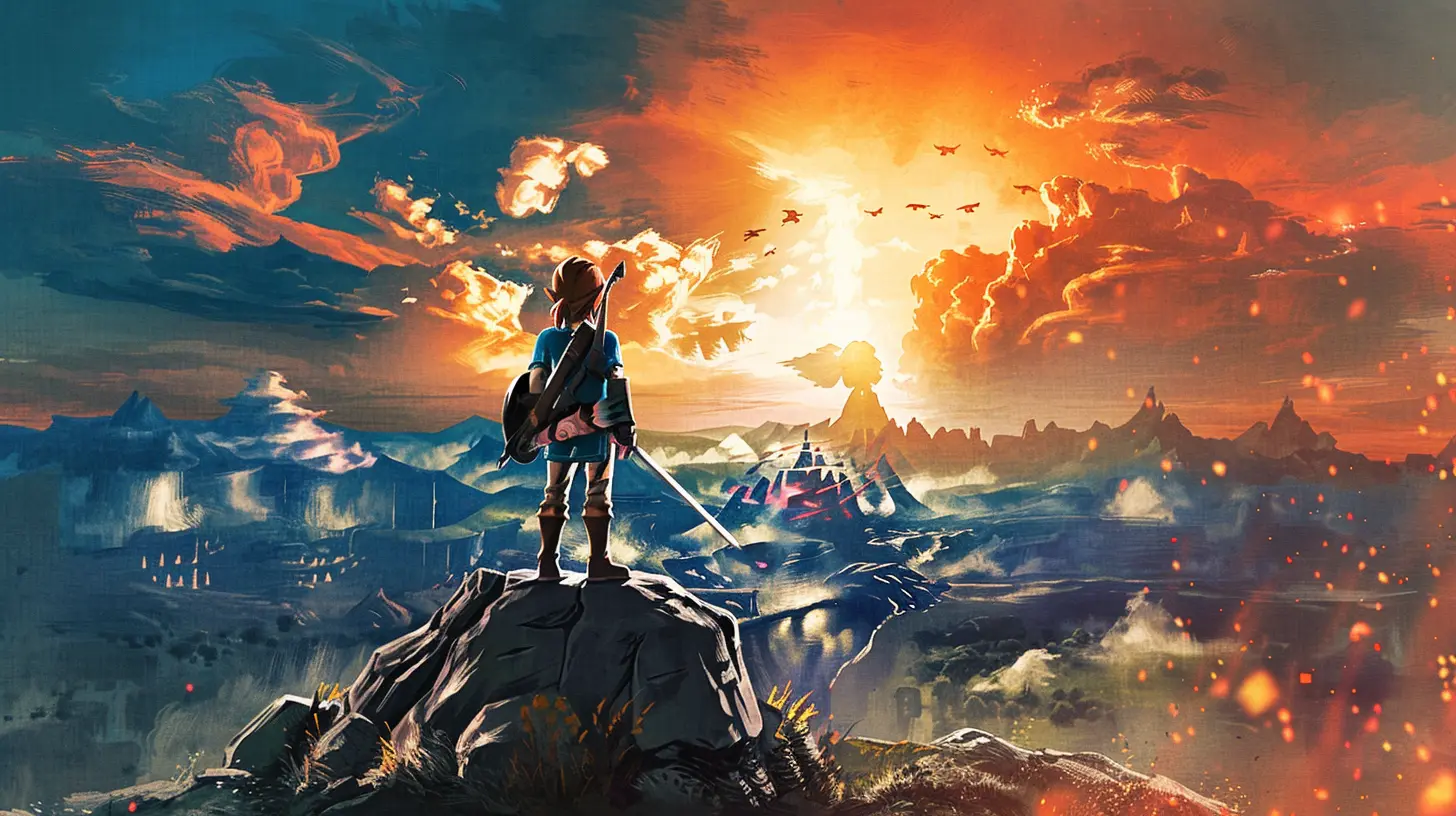
What Is Visual Language in Games, Anyway?
Before we dash off on this pixel-packed journey, let’s clarify what we mean by "visual language." It’s not about characters talking with their eyes (although that happens too), it’s the way games use visuals—like color, architecture, character design, UI, and even particle effects—to communicate ideas, rules, and emotions.Think of it as the grammar of game art. It says: “This place is dangerous,” or “You can go this way,” without spelling it out. Cool, right?
Why It Matters: More Than Just Looking Good
You know that feeling when you step into a game world and everything just clicks? That’s intentional. Visual language gives design cohesion, helps players make decisions, and builds immersion.Let’s break it down:
- Player Guidance: Arrows on signs, glowing paths, or even lighting that subtly leads you where to go.
- Emotional Impact: Dark hues make things feel tense, while bright and bouncy colors create a playful vibe.
- Lore and Storytelling: Architecture and environments can whisper stories of the past—no voice-over required.
Without good visual language, even the most exciting gameplay can feel confusing or flat.
The Masters of Visual Storytelling ?
Let’s geek out a bit and look at how some iconic games totally nailed their visual language.1. The Legend of Zelda: Breath of the Wild
First up, Link's open-world masterpiece. Breath of the Wild is packed with visual cues:- Color-Coded Regions: Snowy areas are blue-tinted and crisp, deserts glow orange, forests are lush greens. You feel the temperature visually.
- Shiekah Technology: The glowing blue tones and ancient stone designs scream mystery and power.
- Climbing Visuals: Jagged cliffs and flat surfaces are visually distinct, so you instantly know what you can scale.
This game trusts you to learn by looking. No heavy hand-holding—just clever design.
2. Overwatch
Overwatch is practically a visual language textbook. Every character has a unique silhouette, color scheme, and movement style.- Instant Recognition: Even in chaotic team fights, you can identify Tracer or Reinhardt in a split second.
- Map Design: Areas are built with color-coded zones to guide players while still looking natural. For example, payload areas are highlighted without flashing lights.
- UI & Feedback: Shots landed? Visual and audio feedback. Ults charged? You’re visually told without needing to look too hard.
Blizzard’s visual clarity is unmatched.
3. Dark Souls Series
Oh boy, Dark Souls. This series is notoriously difficult, but the visuals are both haunting and helpful.- Architecture as Foe & Friend: Areas like Anor Londo feel threatening but majestic. Their design hints at what you’ll face—massive enemies, intricate mazes, hidden traps.
- Enemy Design: You see how dangerous an enemy is before engaging. Spiky armor? Big sword? Yeah, exercise caution.
- Lighting and Color: Light often means safety, while darkness hides horrors. Simple, yet incredibly effective.
FromSoftware makes "show, don't tell" an art form.
4. Journey
If you haven’t played Journey—first of all, do it! Second, this game is a masterclass in visual emotion.- Minimal UI: No HP bar, no minimap. Just you, the sand, and that long scarf.
- Color Progression: The visuals shift as you move forward, reflecting the emotional beats of your journey.
- Environmental Clues: You’re never lost. The environment subtly nudges you forward with landmarks and light.
It's like walking through an animated painting.
Core Elements of a Game's Visual Language
Now that we’ve had our fanboy/fangirl moment, let’s talk nuts and bolts. What are the building blocks that developers use to craft this invisible language?1. Color Theory
Colors aren’t just for making things pretty—they're emotional messengers.- Red = danger, urgency, health
- Green = safety, growth, healing
- Blue = calm, magic, mystery
- Yellow/Orange = energy, caution, attention
You see this constantly in health bars, enemy warnings, or power-ups.
2. Shape Recognition
Different shapes evoke different feelings.- Sharp angles and spikes = danger, aggression
- Smooth curves = safety, friendliness
- Silhouettes = character identity
Developers design characters and icons so you recognize them instantly, even in the heat of battle.
3. Lighting & Shadows
Lighting directs your attention. Shadows build tension.A spotlight might highlight an item you need. A flickering torch down a hallway? Probably a boss fight coming up.
4. Environmental Storytelling
From graffiti on walls to ruins overgrown with moss, worlds tell stories visually.Games like The Last of Us or Red Dead Redemption 2 use their environments to hint at past events or culture—without a single line of dialogue.
5. UI/UX Design
This one’s critical. A clean, readable user interface makes or breaks your experience.- Inventory systems
- Health and stamina indicators
- Objective prompts
Great games make you feel the UI is part of the world, not just floating on top of it.
How Indie Games Push Visual Language Forward
Hold up—we can’t forget the little guys! Indie developers might have smaller teams, but they often go bold and experimental with their visuals.Case Study: Hollow Knight
This hand-drawn Metroidvania uses contrast and silhouette beautifully:- Enemies pop off the backgrounds thanks to brighter outlines.
- The world feels massive and mysterious, thanks to layered art and dark color palettes.
And get this—there's barely any tutorial. The visuals teach you everything.
Case Study: Celeste
This pixel-perfect platformer uses visual cues to keep you in rhythm:- Color-coded spikes and platforms change behaviors.
- Subtle screen shake and particle effects make every jump feel important.
Plus, the visuals match the emotional tone of the story. That’s some deep synergy.
How Visual Language Evolves with Technology
From 8-bit sprites in the '80s to ray-traced reflections in 2024, technology has transformed how games look—and how they talk to us visually.- Better Hardware = More Detail: HD textures, complex lighting, and physics-based rendering push immersion.
- VR and AR: We’re literally stepping into worlds now, so visual language becomes even more critical.
- AI-Powered Art Tools: These help generate dynamic environments and responsive visuals. Think procedural worlds and facial animations that react to your choices.
While the tools change, the goal remains the same: telling stories through sight.
Tips for Spotting Visual Language in Any Game
Want to start noticing these things more often? Here’s how:1. Pause and Look Around: What is the world telling you without words?
2. Analyze the UI: How does it blend with or contrast the game?
3. Watch How You Learn: Are you being shown instead of told?
4. Take Note of Repetition: Patterns often teach you things through repetition—like enemy cues or environmental hazards.
Not only will you appreciate games more, but you’ll also start predicting things like a Jedi. ?♂️
Wrapping It All Up ?
Visual language is the unsung hero of game design. It's the silent narrator, guiding hand, emotional cue, and storytelling partner all rolled into one. When done right, it makes games not just fun—but unforgettable.Whether you love fast-paced shooters, story-rich RPGs, or indie platformers, every well-crafted game is speaking to you—all you have to do is look.
So next time you’re gaming, take a second to see what the game is saying. It might just blow your mind.
all images in this post were generated using AI tools
Category:
Game GraphicsAuthor:

Pascal Jennings
Discussion
rate this article
2 comments
Luna Warren
This article offers a fascinating look at how iconic games use visual elements to convey stories and emotions. Understanding these techniques enhances appreciation for game design and player experience.
June 3, 2026 at 4:46 AM
Pamela Bowers
Sure, dissecting visuals is fun, but let's be real: if the gameplay sucks, all the flashy graphics in the world won't save it. Style over substance, anyone?
May 26, 2026 at 2:54 AM
Pascal Jennings
You're right. Great visuals can enhance a game, but if the gameplay isn't solid, it ultimately falls flat. Balance is key.